2024 Note: I originally published this article on Medium in 2016 during the height of the FreeCodeCamp craze. Some APIs, links, browser behaviors, and assumptions have changed since then, so consider this a nostalgic snapshot of an earlier era of web development. The FreeCodeCamp curriculum would give you a series of Codecademy-style finger exercises, followed by a project where you were turned loose on a small task and expected to figure out how to implement it with your new knowledge.
Intro
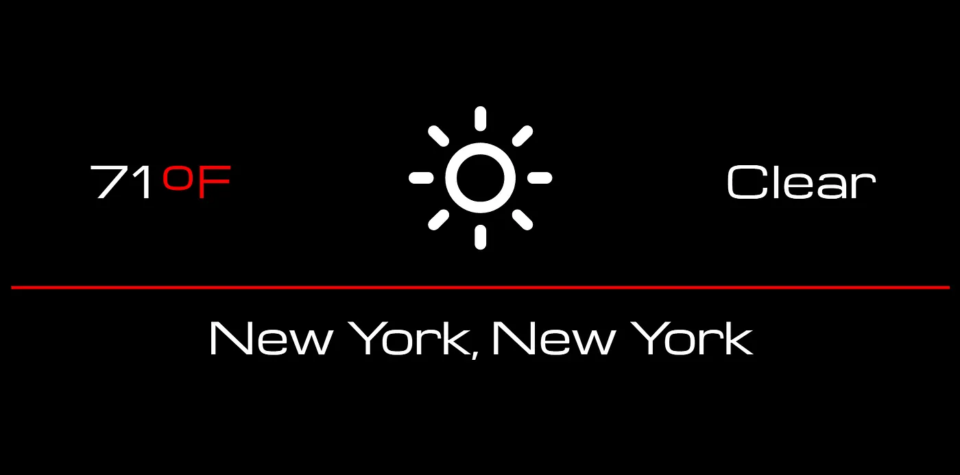
This FreeCodeCamp project involved building a small web page that displayed the user’s local weather. The assignment required you to figure out how to work with JavaScript, browser geolocation, font icons, third-party APIs, JSON handling, DOM manipulation, and basic event handling, which made it a very good learning experience. Since I wanted to make it responsive as well, I ended up adding Bootstrap, jQuery, flexbox, and media queries to address various challenges I encountered along the way.
The assignment described the goals as “user stories”:
- I can see the weather in my current location.
- I can see a different icon or background image (e.g. snowy mountain, hot desert) depending on the weather.
- I can push a button to toggle between Fahrenheit and Celsius.
To this, I added one of my own:
- The page should look as good on my phone as it does on my PC.
To figure out my plan of attack, I wrote out the application logic as a sequence of ordered steps:
- Get the user’s location.
- Use the location to get the weather.
- Use the weather summary to choose the appropriate weather icon.
- Display the temperature, icon, and weather summary.
- Make the temperature toggleable between Fahrenheit and Celsius.
- Make it look decent with HTML/CSS.
1. Get the User’s Location
The first thing I needed was the user’s latitude and longitude. Googling how to do this led to the discovery of the “HTML5 geolocation API.” The browser asks the user for permission to reveal their location, performs some eldritch magic, and passes the data back to my application. Sounded great, in theory, but when I tried out the example, it didn’t work. Huh? My browser wasn’t even asking me if I wanted to let it use my position.
It turned out that, as of April 2016, Google Chrome requires all browser geolocation requests to be served over HTTPS. It won’t even bother asking you for permission — you aren’t given the option to say yes. To unblock myself, I used ipinfo.io to approximate the user’s location from their IP address.
Everyone else working on this particular project was running into the same brick wall I had just faceplanted into, so I made a short CodePen tutorial documenting my temporary workaround and shared it on the FCC forums. The curriculum would get updated sooner or later with a more canonical solution reflecting the new Chrome requirement, but at least for the time being, you would be able to move on with the rest of the project.
2. Use the Location to Get the Weather
After I had the user’s location (or at least, a rough approximation thereof via their IP), I needed to turn it into weather data. FCC recommends using the OpenWeatherMap API, but I decided to try forecast.io instead since the JSON output was a little tidier. Trying to save the API response to a variable I could use later failed miserably. No matter what I did, it was empty. It turned out that because JavaScript is asynchronous, it marches right on to executing the next line of code (in this case, my increasingly desperate print statements) before the API call returns the data.
This was the province of those “callbacks” and “promises” I’d already heard so much about while skimming JavaScript-related discussions on Stack Overflow. Promises are still relatively new, and not supported in some browser versions, so I decided to go the default callback route for now. This was easily the most confusing part of the whole project.
3. Use the Weather Summary to Choose the Appropriate Weather Icon
Many of the little icons you see on sites are not custom images, but instead something specifically called a font icon. Collections of these are widely available for free, much like Facebook sticker packs. I was surprised to find that the icons behaved very similarly to text in that you could style and size them with CSS.
The OpenWeatherMap API suggested by FCC had its own weather icons available as .pngs, but frankly, even I could tell there had to be better looking options out there. I found these weather-themed font icons by Erik Flowers and decided to use them instead. Conveniently, they already had API mappings corresponding to several popular weather APIs; looking through them made me realize that the range of icons I was using was very small compared to some similar services.
4. Display the Temperature, Icon, and Weather Summary
After working out the weather-condition-to-icon mapping, I used jQuery to plop the temperature, weather icon, and weather summary from the API data into three of Bootstrap’s col-sm-4 divs. By default, these three divs lined up in a row. But thanks to the magic of Bootstrap’s responsive grid classes, shrinking the browser width rearranged them from a horizontal row into a vertical stack. I also added a wide col-sm-12 div underneath the row to display the location below a red <hr/> rule.
5. Make the Temperature Toggle Between F and C Units
I was still unfamiliar with jQuery syntax and this was my first time programmatically toggling something back and forth, so I first tested the toggle using dummy data rather than the API data. (Having just been bitten by asynchronous operations for the first time, I was feeling especially cautious.)
My first naive approach was to read the HTML, check which unit was currently displayed, and use an if/else statement to decide what to show next. I was getting a weird [Object Object] type error I didn’t know what to do with, until I asked someone on Gitter for a sanity check. They pointed out that it’d be far easier to just use a JavaScript variable to keep track of the state instead of trying to read it off the rendered webpage. Obvious in retrospect, but a very useful lesson: if JavaScript is generating the output, JavaScript should also track the state. Reading the DOM back into program logic was making the problem more complicated than it needed to be.
6. Make It Look Nice with HTML/CSS
My “signature” colors are black and red, so I picked that for a minimal color scheme. I flipped through some free web fonts and picked Michroma since I thought it looked futuristic.
The vertical alignment of the text on either side of the weather icon gave me some trouble — they were camped way closer to the top of the page than the icon was, making the whole thing look bizarrely lopsided. Stack Overflow suggested flexbox, which worked out nicely. A little later I went to marvel again at my wonderful horizontal-to-vertical responsiveness when I realized that it had stopped working and I now had an ugly scrollbar instead of a vertical row at smaller resolutions. Agh! It turned out that my flexbox changes were fighting Bootstrap’s grid behavior…there’s a long and exhausting Stack Overflow discussion about it here. I solved it by using my first ever custom media query to give flexbox the boot (heh) at any resolutions below 768px, where I wanted the vertical stacking to kick in. Now the contents of my three divs were finally spaced correctly both vertically and horizontally at all resolutions. (As I was quickly learning, this is the primary challenge of working with CSS.)
I wanted a sleek design, so I rebelliously decided to omit an explicit toggle button for the temperature conversion. I instead made the text of the temperature unit red to stand out, and if you hover over it, it turns hyperlink blue to hopefully incite enough curiosity that you try to click on it. For mobile users there is no such thing as hovering — but I’m ok with having it as an Easter Egg. ;)
Other Pitfalls
Bootstrap Doesn’t Do Responsive Text in the Way I Expected
Everything in Bootstrap is supposedly responsive, but I kept getting this horrible horizontal scrollbar at anything below 1920x1080. My horizontal row of 3 columns was supposed to be switching into a vertical row of 3 columns whenever it couldn’t fit, but nope, there the horizontal scrollbar sat.
The culprit was text sizing. I had assumed Bootstrap would collapse the columns when the content no longer fit. In reality, the grid collapses at fixed breakpoints, and oversized text can still overflow before you reach those breakpoints. I solved this by using media queries to resize the base body font size based on browser widths. (In a later project, I found a cleaner way to automate this.)
The Default Font Size May Differ Across Browsers
I initially set my body font size to 100%, then used media queries with em units to resize everything relative to the window width. I’d been codepen-ing in Firefox, and was happy to finally be done with my project. Then I opened Chrome and saw that suddenly the evil horizontal scrollbar was back. On a hunch, I set my base font size to 12px. Once everything was scaling from the same explicit base, the error disappeared.
“Good CSS-coding practice is to define absolute font-size only for the HTML or BODY element, and to define all other font-sizes relatively, that is, in terms of this size (i.e., using
emor%).” —guy on Stack Overflow
All right then. Lesson learned.
The Simulated Console on CodePen Is Not the Same as the Actual Browser Console
Many thanks to the guy on the FCC Gitter who tipped me off to the fact that the simulated codepen.io console doesn’t actually show all errors. The actual browser’s console had all the information I needed, but I hadn’t known it would show anything I wasn’t already seeing in the simulated CodePen console. This project would have taken significantly less time if I’d known they weren’t identical from the get go.
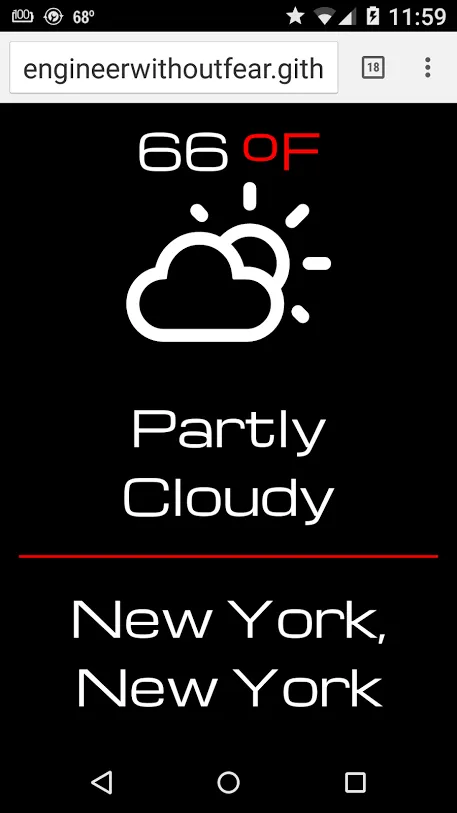
The finished project can be found on my GitHub. There is also a more easily inspectable version available here at CodePen.